I've been working on studies (these are 8"x10") for much larger paintings and drawings. My goal is to have at least 5 of these painted as murals (bigger the better) by this time next year. To recreate the transparency of these colored pencils, I'll be adding a clear medium/polycrylic to my paint. Just so you know.
Marshall Higgins's Illustrations, etc.
I am an artist from Richmond, Virginia. I now live in Philadelphia. See something you like? I do work for hire all the time. Send me an email to marshall.higgins@gmail.com and we can work something out!
Sunday, March 4, 2012
Monday, December 19, 2011
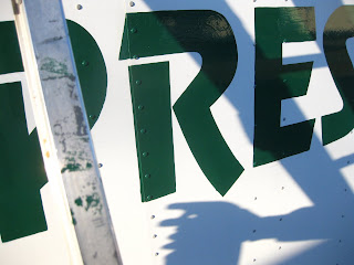
Virginia Highway Incorporated contacted me to paint logos on their fleet of 53-foot trailers. Each trailer got a treatment of one logo per side. All in all, I painted 15 trailers for a total of 30 logos painted. I really enjoyed this project and would DEFINITELY love to do it again.
All truck logos painted with Oneshot sign painter's enamel.
Sticky Rice. Sushi restaurant and bar, Richmond, Virginia.
The bottom picture you see is not my work. It is a sign that was created by an friend of the restaurant who braved
the narrow outcropping of the building- a slanted, 18 inch sketchy ledge- to recreate with a spraypaint a logo that he held
a copy of in his hand. That is an impressive feat.
However, it lacked, in my opinion, the finished, refined look that the rest of the restaurant presented to the public. They have a
website, a blog, and they've sponsored a magazine (I think). I said to the business owner that it would be smart to create a
united front, visually, and have the painted logo look --exactly-- like the logo on the company's stickers, ads, menus, and website. In that sense, I believe that I helped to make an improvement. The top picture is the finished result. I also harnessed myself in while braving that ledge.
Check out Sticky Rice, or its sister restaurant, Togogo, if you are ever in Richmond and would like to eat some good sushi.
Painted with latex paint.
Togogo. Sushi takeout spot in Richmond, Virginia. Before and after.
On the left is the building before I helped to convince them that a larger sign would really help them out.
The arrangement of the bricks created a sort of "frieze" that framed the letters nicely. I thought
that it would be a nice understated touch to house most of the letters within that frame and let
the lowercase g's and the bottom half of the Japanese character hang out. Latex paint with brushes. Also-
good sushi if you are in town.
Tuesday, March 8, 2011
Check out my new book!
This is a compilation of friends' work. I have some work in this as well. Really enjoyed working with the Blurb.com interface. Because of the business model (the books are not necessarily made in bulk), each book is a bit more expensive to make than I would like. HOWEVER, this is such a cool idea for a website. Thanks! -Marshall
Monday, February 28, 2011
Friday, February 4, 2011
Tuesday, January 25, 2011
Sketch
Monday, January 24, 2011
For J.B. Watkins Elementary readers.
Saturday, January 22, 2011
Book preview.
Sunday, January 9, 2011
Monday, December 27, 2010
Friday, December 24, 2010
FP!
I did this for my friends over at Noah Larmz- They throw a dance party every few months or so, and now that they've gotten bigger, are making tchotchkes to sell and hand out. Now, they needed a poster, so I got out sharpies and micron pens. The red "F P" is where I took the file into photoshop and lightened part of the layer underneath a type selection, with Helvetica oblique being the font choice.
This is part of a final poster that will have a "Snakey Mouse" curled around it, framing it. There will possibly be a "Noah Larmz" logo added as well. Paulo/Brian/George/Jason over at Noah Larmz will take care of that part.
Subscribe to:
Posts (Atom)